#app
#startup
#AI
Innovative treatment diary app for dialysis patients
Develop an intuitive app to track daily body metrics and treatment progress for over 1 million kidney failure patients. The app was launched on the Apple Store. I redesigned the app from scratch, and created an illustration and design system.
Product designer
3 months
CEO, 3 developers
The problem
Over 1 million kidney failure patients experience depression and stress due to the current manual treatment progress recording methods.
The solution
Create an intuitive app to track patients' daily metrics and treatment progress, replacing manual records. The design helped the startup secure $600k in VC funding.
What is Uppermed ?
UpperMed has developed a portable device that makes it easier for peritoneal dialysis patients to conduct dialysis by themselves. I was responsible for the treatment diary app.
What are current issues in this system?
To uncover user pain points, I conducted 10 interviews with clinicians and patients…
I developed a questionnaire to better understand the perspectives and challenges of potential users, yielding 20 survey responses and conducting 10 user interviews. From these insights, target users were found to be patients who are 40 - 80 years old.
Jacky Wang
55 / Male
Details
Peter, aged 40, transitioned from being a taxi driver to a new career path due to illness. He is a father of two children under the age of 18.
Inconvenient to record body data 4 times a day
Occasionally forgets to check in at the hospital
Challenge
Improve communication of symptoms and challenges with doctors.
I feel more empowered to manage my treatment progress.
Need

How might we make the diary app more intuitive to enhance patient communication and data tracking?
After identifying the pain points and needs of patients and providers, I sought to improve communication between patients and clinicians and streamline treatment data management. My focus will be on 3 key areas:
Design goals
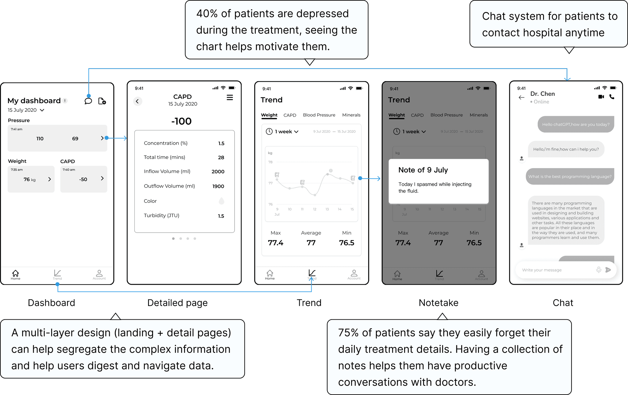
The sitemap shows that main features are on the dashboard

Later, I got 3 Ideations…
Before moving to the next step, I conducted a user test with 10 participants and the 3rd idea was selected for further development with the most votes from users.
Present chosen ideas to the PM using a wireframe
Showcase prototype to developers
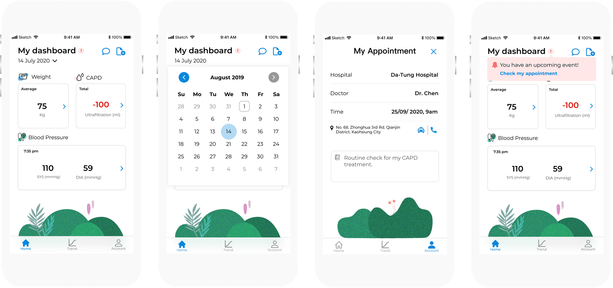
Uppermed App was designed to make it easier for patients to track their treatments by providing a dashboard that collects data and trend charts that display the data's progression while also enabling seamless communication with care providers through a chat function. This makes treatment management easier for patients.

Design iteration
After discussing the wireframe with PM and developers and confirming the structure aligning with the requirements, I started to design the first version of hi-fi design. I tested 10 users with clickable prototypes and got feedback from them and made the iteration. Furthermore, I verified the accessibility of color and font with WCAG guidelines during the iteration, to ensure that elderly users can easily read the content.
INTERACTION IS NOT INTUITIVE
The time picker for “today” was not obvious enough. The detailed data is an expanded card to view and make the info overloaded on the same page.
The chat function is important and commonly used, but was hidden in the account tab. It should not be hard to find it.
CATEGORY IS HIDDEN
On this screen, the main 4 categories data are hidden in the dropbox. It is not very intuitive to see all categories at first and is hard to switch to others.
This lack of clarity made it challenging for users to navigate seamlessly between different categories, leading to confusion and contributing to user drop-off issues.

"Got NPS score 9 in final design's usability test!"
User test Result
The user testing included 10 patients and 10 clinicians. The testing plan involved various tasks, and feedback was collected afterward. I selected error rates and Net Promoter Score (NPS) to assess users' comprehension and satisfaction with our app, serving as key indicators of design success.
Challenge
& reflection
I've enhanced empty states to spark curiosity, implemented family mode for remote treatment monitoring, and added lively animations to make note-taking more engaging.
Through extensive usability testing and user feedback, I improved our health app. It's gratifying to see it help kidney failure patients manage their self-treatment and journey to recovery.
This project taught me that empathy is crucial for designers to understand and meet users' needs effectively. ✨


